• Thanks for stopping by. Logging in to a registered account will remove all generic ads. Please reach out with any questions or concerns.

System Upgrade: Please Report Problems

XenForo doesn’t directly control spell checking feature. I’ve noticed weird glitches but the provider of the editor is a 3rd party and has something to do with them.

Also, I recommend using Grammarly!
I actually use ProWritingAid because it integrates well with my writing software Schrivener. When it comes to these forums I'm just as happy to use the native spell checker. No problems. I'll just tune up my eyeballs a bit.

🙂
 
I actually use ProWritingAid because it integrates well with my writing software Schrivener. When it comes to these forums I'm just as happy to use the native spell checker. No problems. I'll just tune up my eyeballs a bit.

🙂
Never heard of it before! I'll check it out!
 
Never heard of it before! I'll check it out!
It's quite good (although it's brutal in telling you how poor your grammar is - apparently I tend to favour the passive tense rather than the active 🙂) and for a few extra dollars you can buy a license that gives you lifetime upgrades) - It also integrates into MS Word.

Most of the the folks I communicate with in the writing world use either Grammarly or ProWritingAid. Each has their supporters - it's like the old Word v WordPerfect or PC v Mac debates.

🍻
 
The log-in seems to kick me out once or twice a day even though I selected the trust device for 30-days option. The two-step verification makes it a bit of a pain to keep logging in. Is this because I’m logging in in different devices (laptop, tablet, phone)?

cheers
G2G
Is it asking for the 2FA/MFA code every time too? I’ve managed to stay logged in across multiple devices so far. Are you online when it “forgets” you or does it occur when coming back to the site after being away for a bit?


Two very small points:
  1. I very much rely on the system's spell checker to keep me from looking totally uneducated. The current systems red underlining is harder to see than the previous one's and I've missed a few suggested corrections. Is there any way to brighten that up?
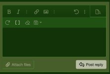
I may be able to make the text box for new posts lighter, but have to be careful; that can change the colours elsewhere as well.
 
Is it asking for the 2FA/MFA code every time too? I’ve managed to stay logged in across multiple devices so far. Are you online when it “forgets” you or does it occur when coming back to the site after being away for a bit?
The 2FA seems to work for about 2-3 days on each device (vice the 30-day stay logged, which I ensure is checked) then I'll have to log-on again and use the emailed 2nd code. I tried clearing the DNS cache recently, so I'll see if that works on my other devices. In the end, a first world problem if I can't get it to work - yet to have to use a back up code, so I still have those if for whatever reason my email is down.

Thanks Mike!
 
Is it asking for the 2FA/MFA code every time too? I’ve managed to stay logged in across multiple devices so far. Are you online when it “forgets” you or does it occur when coming back to the site after being away for a bit?


I may be able to make the text box for new posts lighter, but have to be careful; that can change the colours elsewhere as well.
Don't bother fiddling with this. It's a very minor point and not worth the effort or possible cascading complications. It's often much easier to simply get used to the default that the system gives you. I'm good with it.

🍻
 
Okay. I'm getting a little annoyed now.

I'm quite used to the ads that run throughout the text and know they are a very necessary part of this forum. In the past, and for the first little while of this new system they nestled in amongst the posts and you could scroll past them or read them as you wished. Today they seem to nestle in the top left corner of the header and won't move for love or money. The result is that roughly the upper one half of my page is permanently blocked. Can these things be made smaller or put back into the scrollable portion of the page?

🍻
 
Whoops. It just got worse. I've had a couple of pages where the ads also covered the bottom half of the screen leaving the text portion in about a 1/10th of a page ribbon in the middle and another where an ad settled in above the ad in the header leaving about a tenth of a page of text at the very bottom.

🍻
 
One way to make them disappear is to subscribe ;)
What! And miss all the eBay ads for a Marklin model railroad painted up by some user in a WW2 paint scheme? Bought one item off eBay two months ago (no not a Nazi train) and this ad has followed me everywhere. Big Brother is here to stay.

:poop:
 
One way to make them disappear is to subscribe ;)

While wary of drawing attention to myself as a non-subscriber, I've noticed that the previously available link to subscription information doesn't seem to have survived migration to this new software.


. . . I probably shouldn't have posted. Now it appears that the ad-gremlins seek to extract revenge and block the complete page with multiple versions of sometimes the same ad leaving only space to view a portion of one line in the topic. Clicking through all the steps to close the ads eventually opens up enough of the page to actually read the thread.
 
Last edited:
Ditto on the ad space problem. A square box ad in the space that looks like it should be 628 h x 1200 w is overflowing vertically (much more than 628h I suppose) and squeezing the page content out. Add: given that it's upper left justified and the menu bar appears to right of it, bottom aligned, it has the look of a float issue.
 
Ok, I may have slowed down the rampaging ads. Odd, I have not changed a thing wrt advertising since we went live on Christmas Eve with the new site. I suspect Google is just getting more aggressive with the inserts. I'll see if I can scale it back to something reasonable... if not I may have to ditch ads, at least for now.

While wary of drawing attention to myself as a non-subscriber, I've noticed that the previously available link to subscription information doesn't seem to have survived migration to this new software.
Things have moved around, and in an effort to keep things simple, I have removed a lot from the menu system. Under the new system, Subscriptions can be found under “Account Upgrades” on your profile:

 
I have, for now, completely disabled ads. I like it, but in recent years, the site has largely sustained itself on ad revenue.

I do not want to pressure users to “pay to play.” The whole point in my view is the site should be free for all, with the option to support via subscriptions (upgrades) for those that can and want to.

Advertising is a good way to cover costs without too much user inconvenience, but not when it goes overboard. :)

I’ll find a way, please be patient!
 
I don't mind ads on the site at all and completely understand why they're there so long as you can scroll past them to get to the content. Up until a few days ago (old system and new) everything was working properly. A few days ago an aggressive one would populate the bottom half of the page and asking me to select some type of "push notification" system and wouldn't move until yesterday when it eventually allowed me to "not show again".

Today was a whole different thing.

🍻
 
What does "enable push notifications" mean anyways?
 
What does "enable push notifications" mean anyways?
It allows Chrome and other browsers to use the "toast" popups in the lower right of your screen to notify you of new DMs, replies to threads you are following, etc.
 
Back
Top