• Thanks for stopping by. Logging in to a registered account will remove all generic ads. Please reach out with any questions or concerns.

New Forum Header Graphic

Which do you prefer?


  • Total voters
    66

Mike Bobbitt

Site Owner
Staff member
Owner
Directing Staff
Reaction score
349
Points
1,410
All,

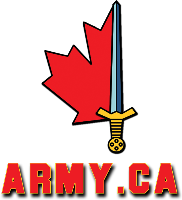
RossF has provided a couple of potential header images for the forums. These images would replace the "Army.ca Forums" text in the upper left. We've decided to create a poll to see which image is generally preferred before putting one in:

Image #1:
armyca29px.jpg


Image #2:
armyca37xh.jpg


Also, if anyone else has the desire and ability to create potential header images, please feel free. The only caveats are that it must not use copywritten images (images from the Army.ca gallery are fine) and must not be more than 62px high. If we get enough we could have them automatically rotate.


Cheers
Mike
 
To be blunt I dont really like any but the second has to be the better of the two  ;D , if you give me a week I should be able to make something up.
 
hmm do I see a proper contest a brewing?.....


I shall await all entries, then, before I post my vote.

dileas

tess
 
If anything, I've helped create some fun.

Those 2 images were beginning ideas.. I might come up with some others.  ;D Although I do still like the second. The first one was for a design that fit into the background colour of the forums.
 
Here's how each one would look...


(when you open those two pictures you might need to click on them again to view them in the proper size)

Hey, I have nothing better to do :P
 
scm77 said:
Here's how each one would look...


(when you open those two pictures you might need to click on them again to view them in the proper size)

Hey, I have nothing better to do :P

That was a really good idea. Although I like my second one more..the first one blends in nicely.
 
I like the second one as well. Looks sort of choppy though, any way to make the 3 images blend in with each other better?
 
P-Free said:
I like the second one as well. Looks sort of choppy though, any way to make the 3 images blend in with each other better?

I think I managed to fix any "choppy" look.

This one is with an over all blur kind of effect.

armyca46pc.jpg


This one is just fixed choppiness.

armyca51bc.jpg
 
Ros after looking at those photos again I can say that the 2nd is acually pretty good, but I think you need to fix the border on it. Maybe change the border color? not sure really, I have been out of graphic design for a while now.. Anyway I can tell you one thing for sure, that attempt to fix the choppiness(I think it is non exsistent, I dont think it really needs to look seamless) is way to noticible, too many smears. I think the 2nd just needs its borders fixed a little. Ill still try and create one so maybe you guys can rotate from a few.

Edit: Upon futher review I think maybe changing the border from white to a darker green may even look nice, oh and the pic in your sig looks sweet.
 
Is it going to be just the one? I like the current set-up, where different ones show up. I like the ones I've seen so far, but I like the suggestion of opening this wider like a contest.
 
van Gemeren said:
Is it going to be just the one? I like the current set-up, where different ones show up. I like the ones I've seen so far, but I like the suggestion of opening this wider like a contest.
I believe its just going to replace the "font" on the main page..ccold be wrong though.....Mike?
 
recceguy said:
Get rid of the MGS, someone will say we're supporting the POS.

heheh, that was accually the only reason i voted for #2.. I Dont like the Stryker being in there. but the colour on the 1st one does blend better.
 
I'd prefer this one with a LAV III APC in place of the MGS:
armyca29px.jpg


Any other font options?
Like the old "MASH" font?
 
Back
Top